Tuesday, February 21, 2012
Monday, February 13, 2012
Mini Art School #3 - Cover Redesign

If there is one thing I have gotten out of the whole art school program, is that it is when you understand good design, it becomes easy to replicate.
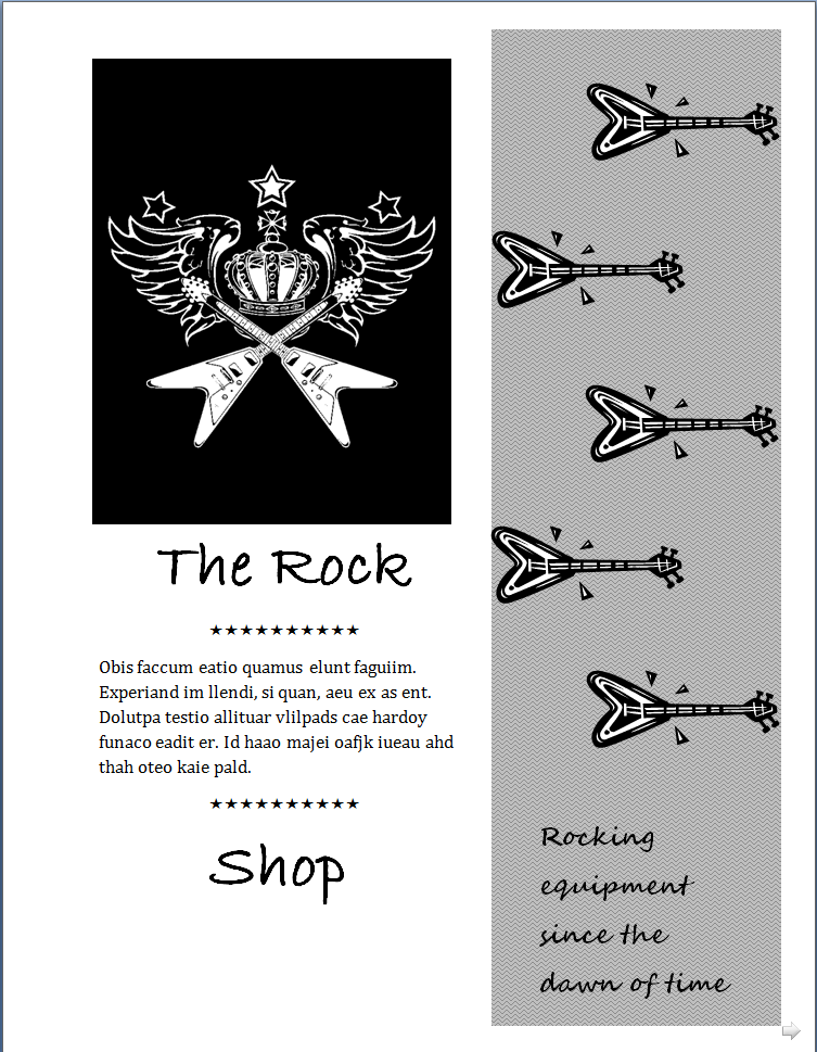
Having to redesign a book cover just based on a title almost begs someone to make a joke about judging a book by its cover... but I digress. "Flirting with the Bully"will be a best seller because it is geared toward the tween generation. The neon hearts on the borders focus the attention towards the middle of the picture. Though I don't love how things are centered, I think it works because I only have two or three items to look at.
A person looking at this for the first time will first look at the "eyes" of the bully. I think my choice of pictures and how the go together make this book a serious read, in a rebellious teenage sense.
Mini Art School #3 - Borders

Silly, happy borders. So overlooked yet, it can make or break a picture. For this exercise, I choose to do four different borders around the time traveling car from Back to the Future, the Delorean. My borders were selected to echo how amazing this car actually is.
I choose a border that was broken up by dashes, a border of a think black line, a embossed border, and a yellow, highlighted border. Out of all four, I love the black border the best. It focuses the attention to the car and makes it the most important item.
Mini Art School #3 - Cropping
Cropping photos can be a cathartic activity. Often times, the picture that you have originally is not the best it could possible be. As we have read about, cropping allows the user to pick out and focus on other parts of the photo. They crop out things that are unnecessary to the main point of the picture and make it more visually pleasing.
For my first photo, I choose a shot of the Mexican beach front. With these crops, I was just trying out the different edits that were available. I don't often crop photos. I tried to figure out which crop made the photo look better than the original. Were the pictures telling a better story? I love either the sun or the fade in crop. The sun reminds me of what is was like to be on the beach - with the ocean in the background, I couldn't think of a better picture.

My second picture was an action shot of my dob, Bailey. We were at a baseball game and she was singing along to the National Anthem. I wanted to focus the attention on her barking along with the song so I choose crops that were action oriented. The cutout crop of diagonal spokes speaks volume and I love how her mouth is the focus of the picture.

Finally, I choose a picture that most Americans have seen before, the Lincoln Memorial. I took this picture last year on my class trip with the 8th grade. I choose some border crops that helped to emphasize how important this monument was. While the black border was great, I decided to crop the photo down to focus on Lincoln and his quote. I found that this really put the emphasis on who he was and his overall importance.

Tuesday, February 7, 2012
Mini Art School #2 - Compositions
I am not an artist. I don't pretend to be. I believe my best artistic work came in the fifth grade when my best friend and I came up with some comic strip. We would fill the strip with different superheroes, which were based off of fruit. Appleman, Orangeman, Mr. Pencil and Banana Boy. That was the highlight until I tried this exercise from Design Basics Index in which I needed to design and create compositions for the corporate world.

I do not have a "Vector" program like they wanted us to use in the book so I used pencil and paper to do my sketches and final drafts. The corporation I went with was in the medical field. From these basic, early, and rather contrite sketches, I drew up about twenty or so designs for the medical field. Because the next major holiday is valentines day, I choose to do something with the heart, though I didn't at first. I skipped around, randomly drawing, using shapes and contours until I found some designs that worked for me. The heart and the medical cross kept popping up into my head. So, out of all of those, I choose three to refine.


I do not have a "Vector" program like they wanted us to use in the book so I used pencil and paper to do my sketches and final drafts. The corporation I went with was in the medical field. From these basic, early, and rather contrite sketches, I drew up about twenty or so designs for the medical field. Because the next major holiday is valentines day, I choose to do something with the heart, though I didn't at first. I skipped around, randomly drawing, using shapes and contours until I found some designs that worked for me. The heart and the medical cross kept popping up into my head. So, out of all of those, I choose three to refine.

These were the hardest ones for me. I went back and retraced to make sure that I put emphasis on certain items.
1. The first example is of a heart and the cross behind it - which means that they (the hospital, doctors, or whoever I am pitching this to) will always be there. I also put inside the heart the EKG monitor and it is spiking at the last moment, signifying that this place is where you want to go if your heart stops.
2. The second design is of a broken heart. It is torn down the middle and a band aid is over top of it. The use of the bandage signifies that they will be there to heal broken hearts. Out of all of the designs, this was the weakest one. Are they supposed to fix unhealthy hearts or hearts that are broken from love? The design had some flaws.
3. Finally, my coup de grat. It was a shattered heart and standing behind it was the cross, yet again. The cross is bringing the pieces back together, mending and repairing. I loved this design. I would put vibrant colors into this one next time if I could. That is the only thing it is lacking. Color would make these pop.
Mini Art School #2 - Typography
I only use one or two fonts. I rarely change it up and I hardly ever notice when other fonts are used. In Design Basics Index, I was introduced to the use of type and why it is used. I felt like a horse with the blinders on - I never knew that there as some sort of agenda when it came to what type of type was used (pun, clearly intended) or about the size and shape. I had a feeling that the underline, bold, and italic buttons had significant meaning but when it came to actual type face, it blew me away.
 I began to think about my own choices when it came to choosing type - do I purposely choose a font that makes me seem bossy and professional or do I choose a font that makes me seem more jovial and energetic? I went through a few of my documents and found that I am mixture of both but that a variation of type can really help bring out a point or meaning. Take for instance the twelve fonts chosen below.
Thursday, February 2, 2012
Mini Art School: Repetition
I'll be honest - I do not have a taste or talent for art. I get easily frustrated and working with applications like Word and others can be bothersome. This took time for me to finish. While I am not proud of this as my work, this was the best I could accomplish before throwing my chair through the computer screen!


Mini Art School: Redesign


So, for my next Art School adventure, I decided to redesign an old flyer I had for my Table Tennis Club at school. It was basic, boring, and non-inviting.
What I tried to do was to center the focus on a few key points and have the flow of the picture move towards the pictures and then the dates of when the club will be held.
Mini Art School: Website Critique
In my first art school activity, I critiqued two websites and their flaws. I had a lot of fun doing this and it was great to apply what I had learned from the readings to reality. As I move forward, I will be looking at designs of websites differently thanks to this activity.
Enjoy the screen cast!
Subscribe to:
Posts (Atom)