I only use one or two fonts. I rarely change it up and I hardly ever notice when other fonts are used. In Design Basics Index, I was introduced to the use of type and why it is used. I felt like a horse with the blinders on - I never knew that there as some sort of agenda when it came to what type of type was used (pun, clearly intended) or about the size and shape. I had a feeling that the underline, bold, and italic buttons had significant meaning but when it came to actual type face, it blew me away.
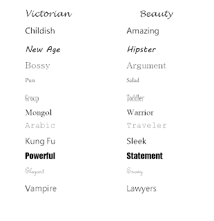
 I began to think about my own choices when it came to choosing type - do I purposely choose a font that makes me seem bossy and professional or do I choose a font that makes me seem more jovial and energetic? I went through a few of my documents and found that I am mixture of both but that a variation of type can really help bring out a point or meaning. Take for instance the twelve fonts chosen below.
 These fonts are presented in two forms - one where I try to write words that relate to the type face and then in the other, I choose words that are the opposite of what the font was trying to do. I had some fun with these and I realized that all fonts, no matter how trivial they may seem, have some derivative meaning and gesture. This activity was entertaining and next time I present a lesson, I will be sure to use something that emphasizes my points and meaning!

No comments:
Post a Comment