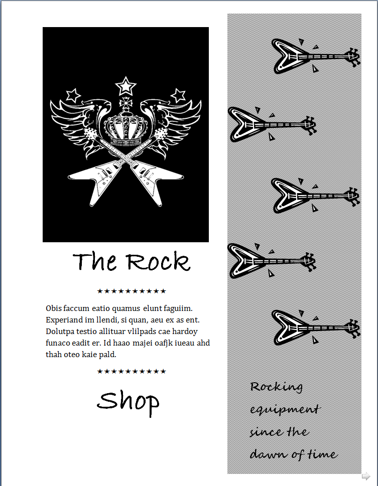
I'll be honest - I do not have a taste or talent for art. I get easily frustrated and working with applications like Word and others can be bothersome. This took time for me to finish. While I am not proud of this as my work, this was the best I could accomplish before throwing my chair through the computer screen!


5 comments:
Hi Tim,
I appreciate your honesty with attempting this exercise. Being enrolled in this course does not require a penchant for the arts, though it certainly assists with the design elements of this course (particularly the Mini Art School unit). Thanks for embracing the assignment and taking the time to attempt to make it work despite your frustrations. While you admitted that you don't feel it's your best work, which design of the three do you like the most? Why?
Erica
Thanks Erica, I appreciate the kind words. While I know things are frustrating now, I hope that with repetition (no pun intended) I will be able to do these with more ease. Out of all the designs, I love the first one the best. I like the fact that it breaks up the page and directs people to the information.
Hi Tim,
You're quite welcome! I like the first one as well, though I really like the image in color in the third version of the flier. I agree that the first design does break up the information nicely.
Thanks!
Erica
Hey Tim, I echo your frustration in the sense that it took me until yesterday to muster enough inspiration to choose a project, and then it took me to 2:30am to finish, haha. So I am right there with you!!
I agree as well that the first ad seems to convey the message most effectively, but I am slightly distracted by the wavy background behind the guitars leading down. But I like that the border brings your eye down as you continue to read the message. I am probably the simplest designer in the world, and I appreciate the second ad a lot. It's straight to the point with a healthy margin of space. My only suggestion is to make the image a little bigger, and we woul see the message more clearly. Overall I think the ads are well-done, especially if you're saying that art is not your thing ...
I'm curious, why did you choose the scripty font? It look like a hybrid of radley Hand and Lucinda Handwriting. Was there a reason for choosing it? To give a more human nature to the ad? Or no? :o) Just curious!
Tim I feel your pain! I am struggling right now as well with similar urges to throw my computer. I think your ads came out great! Remember this is our trial and error period so we can't expect complete perfection. Personally I like your first poster the best. I think it has the edgiest feel. How about you?
Post a Comment